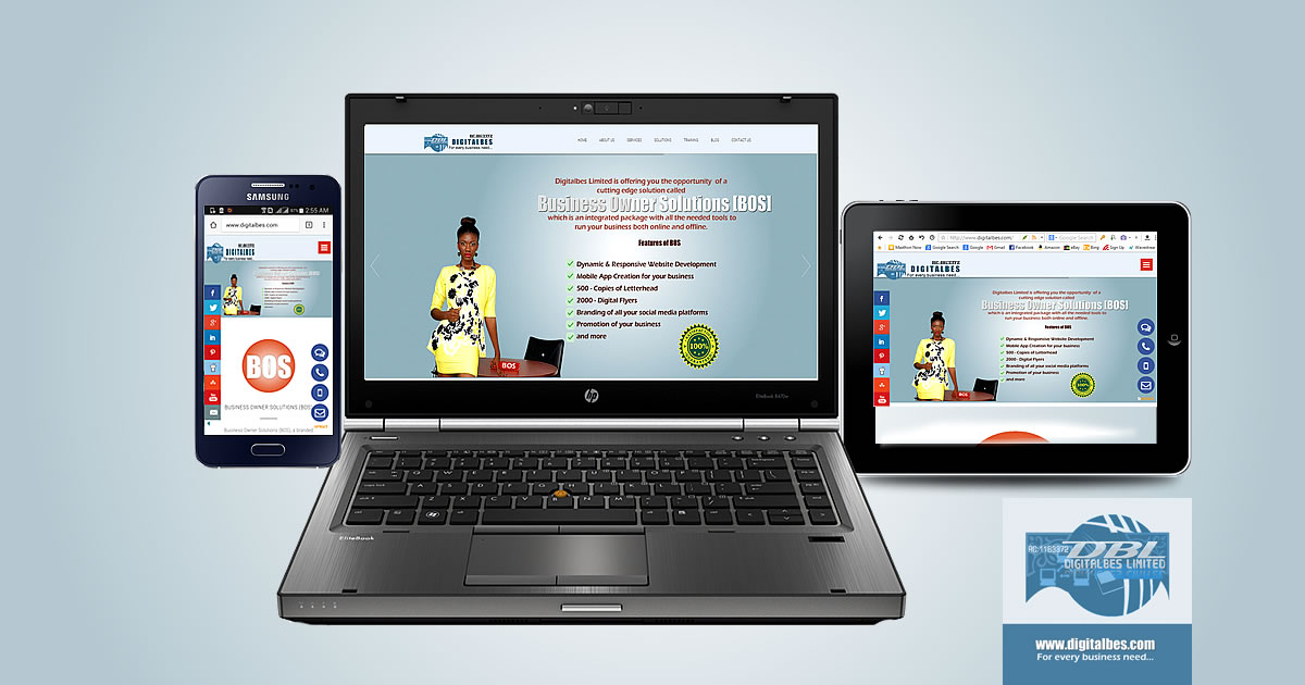
The rise in the use of mobile devices (including iPhone, Smartphone, iPad and Android tablets) means more individuals tend to access the web via these devices. These devices have gradually replaced the use of PC (desktop/laptop computer) as the primary mode of accessing the web. This means that each individual today will need a responsive version of their site that could be operational on all devices (including desktop, mobile phones and tablets).
A responsive web design is arguably one of the most powerful concepts in the web designing industry but the question is, why does it matter for your website? This article addresses several key reasons why responsive web design matters.
Why Does Responsive Web Design Matter Than Ever?
Responsive web design has been found to be vital to website owners due to the following reasons:
-
The Ever Growing Mobile Usage
Recent studies have found that the adoption and usage of mobile devices has overtaken the use of desktop computer when it comes to accessing the web. Responsive design one the other hand allows a website to be accessed on all types of devices.
-
Increased Conversion and Best User Experience
Responsive sites can make visitors happy with your website. Your conversion rate rise significantly using a responsive website (either on mobile or any other versions).
-
Responsive Web Design is the Naturally Preferred Choice for SEO
Google and most other Search Engines prefer working with responsive websites. Google recommends and explains why the mobile responsive website design matters. In a number of studies, it has been concluded that mobile-friendly websites perform far better and load within a second or even less. This makes it a lot easier for web users to share and connect to your content using a single URL.This proves the main reason SEO guys prefer to use a mobile version because the sites have one URL / the same HTML, this makes it much easier and efficient for Google crawl and index.
-
Reduces Page Load Speed
The page load time is arguably one of the most important factors to take into account when it comes to your Search engine rankings. It is important to note that Google always rewards the fast-loading webpages, pages that load within one second or less. A mobile web design offers fast loading. With it Google can easily discover the content efficiently and index all the content.
-
Reduced Bounce Rate
Responsive websites come with lower bounce rates when compared to the regular non-responsive websites. They (responsive websites) offer content to web users in a package built to allow for easy viewing and managing, thus ultimately keeping the users on your page as well as you achieving a lower bounce rate.