- April 28, 2022
- dbl
- 0
Problems of Bad Website Designers
We have decided to write about this article, problems of bad website designers because the way our present world is structured, there is a great need for a website for businesses and personal use but most the business owners do not know when they have a bad or good website but all they see is that the website is not making money.
In most cases, after a year or two, they stop investing in the website and continue to try their local way of running their business. This is usually caused by the problems of bad website designers. So, business owners should know how to choose a good website designer that can understand their brand, study their competitors, and know-how to structure their website interface to meet the demand of the business or personal use.
Looking at the article, problems of bad website designers, we are not talking about the fun kind of bad, like a ’90s design that’s so bad it’s good. We’re talking about the kind of business website that looks okay at a glance but is secretly hurting your customer experience – and sales.
Website problems come in all shapes and sizes, but they usually fall into one of three categories: user experience (UX) issues, content issues, and problems with the design or build itself.
Let’s talk about common signs of a bad website – and how to fix these web design mistakes.
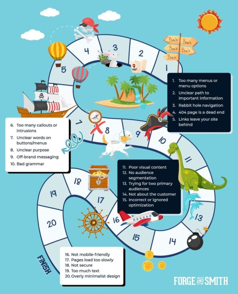
What Makes a Bad Website
Bad Website UX Problems
1. Too Many Menus or Menu Options
2. Unclear Path to Important Information
3. Rabbit Hole Navigation
4. 404 Page is a Dead End
5. Links Leave Your Site Behind
7. Unclear Words on Buttons/Menus
Bad Website Content Problems
8. Unclear Purpose
9. Off-Brand Messaging
10. Bad Grammar
11. Poor Visual Content
12. No Audience Segmentation
13. Trying for Two Primary Audiences
14. Not About the Customer
15. Incorrect or Ignored Optimization
Bad Website Design and Build Problems
16. Not Mobile-Friendly
17. Too Slow
18. Not Secure
19. Information Overload
20. Overly Minimalist
Bad website UX problems
A great user experience offers clear, logical paths to information, with the right content and messaging delivered at the right stages of a customer journey.
If your website has major UX issues, it prevents people from taking the kinds of actions you want: clicks, downloads, form fills, and purchases. Here are seven UX problems found on a bad website.
1. Too Many Menus or Menu Options
2. Unclear Path to Important Information
3. Rabbit Hole Navigation
4. 404 Page is a Dead End
5. Links Leave Your Site Behind
7. Unclear Words on Buttons/Menus
1. Too Many Menus or Menu Options
Studies have shown that when given too many options, the human brain can get so anxious that it won’t pick anything. You don’t want to create that situation with your website’s menus.
If your site has menus on multiple sides of the page, or too many drop-down options under each heading on the main menu, a visitor’s eyes can quickly glaze over. The likelihood of them finding the information they need to convert is slim to none.
2. Unclear Path to Important Information
In the same way that too many options are a problem, not being able to find an option is also a conversion killer.
Most Internet users are accustomed to a common standard of how and where they’ll find information on a business website. Placing content in abnormal locations, hiding menus, or putting key information behind too many clicks will create unnecessary confusion.
The result might be that your visitors give up and move on to your competitors’ sites.
3. Rabbit Hole Navigation
One of the biggest web design mistakes we see among small businesses is “rabbit hole navigation”, or a lack of lateral opportunities (enticing related or featured content) to help a potential customer discover more content.
If you let the reader get to the end of a post or project and don’t offer the next step, you’re ending their journey – and creating a window to exit.
4. 404 Page is a Dead End
The 404 page is what your visitor sees if they make a typo in the URL, or click a link to a page that no longer exists. Check your website’s error log or Google Search Console to see how often this happens to your audience.
Not finding the content you wanted is frustrating. If your 404 page offers nothing more than an apology and the ‘back’ button, or a simple link to your homepage, you’re missing a big opportunity to turn a negative experience into a positive outcome. This page should create an enticing bridge back to key areas of your website – not a dead end.
5. Links Leave Your Site Behind
Speaking of dead ends – when a visitor exits your website, the chances of conversion plummet. Does your site have links within the copy of the design that open new content in the same browser tab? You’re voluntarily replacing your own site with someone else’s.
The same is true of any other linked content on your website, including your social media icons or CTA buttons to third-party payment pages. Don’t rely on your visitors to use that back button!
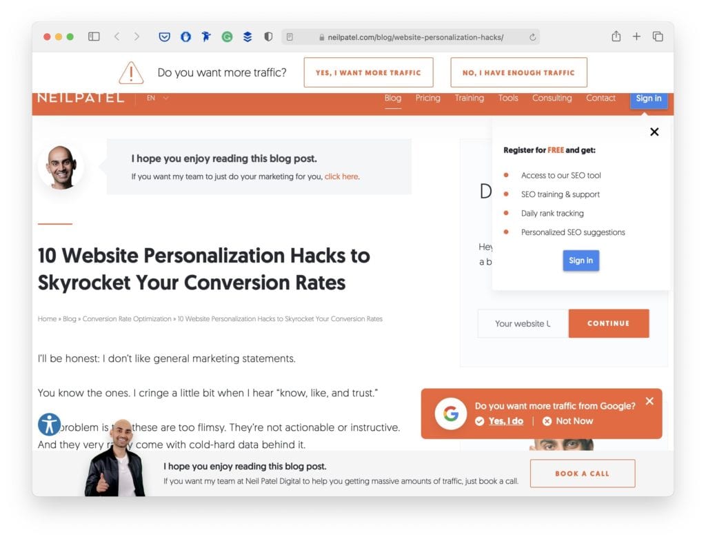
6. Too Many Callouts or Intrusions
Remember how too many menus or menu options can cause a visitor to pick no option? The same is true about content that interrupts the natural flow through your website. This includes too many callouts to visit another page, and intrusive interstitials (pop-ups).
Callouts and pop-ups should be used judiciously, or you’re just going to annoy the visitor into leaving. There are also SEO rules to pop-up design, otherwise, you risk hurting your ranking.
7. Unclear Words on Buttons/Menus
It can be mighty tempting to go for quirky, cute wording on your call-to-action (CTA) buttons or menu items. But if most of your audience doesn’t get it, they’ll never click to see that content. This is especially harmful if the buttons lead to bottom-funnel pages where conversions happen.
Some companies do find success using clever phrasing on their CTA buttons – it depends as much on the text as it does on your audience and industry. Surrounding images and the copy can also influence whether the intent of a button is understood or not.
Research and testing can help you decide if an indirect copy is worth the gamble.
Bad Website Content Problems
There are many websites out there that have great user flows, but still see an abnormally high bounce rate (you can fix that!) or poor conversion rate. Take an honest look at your content, to see if your site’s look and feel or creative elements are driving customers away.
8. Unclear Purpose
9. Off-Brand Messaging
10. Bad Grammar
11. Poor Visual Content
12. No Audience Segmentation
13. Trying for Two Primary Audiences
14. Not About the Customer
15. Incorrect or Ignored Optimization
8. Unclear Purpose
When someone visits your website, can they immediately understand who you are and what services or capabilities you offer? Instead of purposeful content in page banners and callouts, a bad website might have:
- Lots of jargon, buzzwords, or words that just don’t say anything
- Almost no visible copy, so you have to hunt to learn what it’s about
- Promises of outcomes, but no clear offering or details to support the claim
It takes just 50 milliseconds (0.05 seconds) for a visitor to form an impression of your site and decide to stay or leave. Make that impression strong and clear.
9. Off-Brand Messaging
What if that first impression is totally clear, but totally wrong? We see some of these website messaging mistakes way too often:
- Overly technical copy
- ‘Stuffy’ copy that doesn’t sound human
- Copy that talks down to the customer or makes them feel bad
- Copy that strikes the wrong tone for the subject matter
- Outdated or confusing references
- Inconsistent voice between different website pages and posts
- Inconsistency between ads, social media, emails, support chatbots, and website
Your site represents your business in the same manner as a sales or customer service rep. If it doesn’t resonate with a visitor, they won’t stick around.
10. Bad Grammar
It’s one thing to use conversational language on your website, and another to have unintentionally bad grammar. With so many free online tools to help proofread your work, there’s no excuse for typos!
A mistake here and there won’t hurt your search ranking. However, grammar and spelling are quality signals among Google’s 200+ ranking factors. And if visitors frequently exit your site because bad grammar gives a negative impression of your attention to detail, Google picks up on those signals.
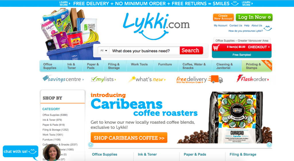
11. Poor Visual Content
Outdated styling, cheesy stock photography, low-quality images or videos, and illegible or mismatched typography are huge barriers to keeping visitors on your site.

We frequently redesign websites for trades and industrial companies with heavily outdated content. They have exceptional reputations built on decades of experience, but customers and other industry professionals have complained that their sites are missing key content or feel unprofessional due to an outdated design.
Your website needs to be visually appealing, readable, and evoke a sense of trust and leadership.
The above site is such a gem of bad design, stock photos, and typography that I can’t resist using another screenshot:

12. No Audience Segmentation
Does your website have clear navigation, content, and messaging for each of the groups that use it? Most businesses have more than one audience accessing their site. For example:
- Potential customers
- Staff
- Existing customers with logins
- Industry peers
- Potential donors or partners
Lumping all of your potential visitors into one general user experience creates unnecessary barriers to conversion. Each extra click they have to take while trying to find what they need forces them to choose if it’s worth the effort.
13. Trying for Two Primary Audiences
If you try to please everyone, you’ll end up pleasing no one. This is important to understand when planning your website. From menus to images buttons and copies, these all need to be created with a persona in mind.
By trying to cater equally to two distinct audiences, you’ll end up with a confusing user experience that doesn’t do a good job for anyone.
14. Not About the Customer
Is your homepage filled with humblebrags about your greatness? You might truly be the best in the industry, but no one will listen if your content reads like a pushy salesman.
Websites are no longer just online brochures promoting your business – and if yours feels like one, it’s probably a bad website. People come to a business site to understand how you can solve their problems. The less you speak to your customer’s pains and gains, the fewer conversions you’ll get.
15. Incorrect or Ignored Optimization
You can pretty much ruin all the time and effort that went into designing your website by skimping on SEO. If search engines can’t understand your website or misunderstand it, you are definitely hurting your business.
Here’s some tough love: Google owes you nothing. Just because you have a website, doesn’t mean it will rank well, rank at all, or even rank for the right searches. SEO is a continuous game, and it’s up to you to adapt each time the rules change.
Common SEO mistakes include:
- “Doing SEO” once and never re-optimizing your site again
- Only focusing on one aspect of SEO, like on-page optimizations
- Believing in SEO myths
- Using outdated SEO practices
- Optimizing for the wrong search intent
Incorrect optimization brings in the wrong traffic, which results in negative engagement signals (telling Google to rank you lower) and poor conversions. Ignored optimization leaves it entirely up to chance for people to find your website.
Bad Website Design & Build Problems
Sometimes website problems are nestled within the page design, structure, or even how and where it’s hosted. The last items on our Bad Website Checklist relate to your website’s design and build.
16. Not Mobile-Friendly
17. Too Slow
18. Not Secure
19. Information Overload
20. Overly Minimalist
16. Not Mobile-Friendly
Given the current digital landscape, one of the worst web design mistakes you can make is having a poor mobile experience. Your customers are using great websites all day long. If they come to yours and the images and copy aren’t scaled to mobile screens, menu options are too small to tap, or if some content doesn’t display correctly – they’re out.
Mobile accessibility is important for both your SEO and your user experience. With so many affordable platforms and design solutions available, there’s no excuse to have a non-responsive website!
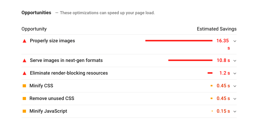
17. Too slow
Mobile responsiveness and page speed go hand-in-hand. This is equally true from UX and SEO standpoints – Google expects it, your audience expects it, and you can’t afford not to bring it.
Slow page loads could be an issue with the server where your site is hosted, and you may need to run updates or get technical support. It could also be that you have giant images or video content that slow things down. Issues within your site’s code can also impact speed.
Whatever the reason, a slow site comes across as unprofessional and costs you, visitors.
18. Not Secure
If your site isn’t securely hosted – if your page URLs start with HTTP rather than HTTPS – this sends out warning signals that you don’t want your customers to see (especially if you’re any kind of security company!).
Google favours secure sites, so right away you’re sending off negative ranking signals. Chrome and other browsers also warn people if they’re about to visit a non-secure site. If your audience cares about their privacy and data (and who doesn’t?), this warning combined with the plethora of other search results can drive them away.
Site security extends beyond your hosting and includes all of the pieces that make up your website.

19. Information Overload
When visitors land on your site, are they slammed with walls of text? Is every page full of chunky paragraphs and few or no images?
Designing for the web is about creating easily digested content. That means short paragraphs, scannable styling, plenty of visual content areas and white space, and concise information delivery. This is especially important for mobile readers – what looks okay to you on a desktop might feel like endless scrolling on a phone.
20. Overly Minimalist
On the opposite side of the bad website spectrum, your site might be an information void. An overly minimalist landing page design with only one word and a menu, or a few vague words that are meant to be mysterious and intriguing, is not appropriate for most types of business.
It’s tempting to try out a trendy or unique web design to showcase your company’s innovative spirit, but always put the user experience first. If your futuristic site design buries menus in weird or hard-to-find places, especially on mobile devices, visitors won’t bother to look.